重拾 CSS 的乐趣(下)
最后更新于:2022-04-01 03:11:20
> 原文出处:https://github.com/cssmagic/blog/issues/54
接下来,要向大家介绍一件最近让我非常高兴的事情。我相信它也会是所有 CSS 开发者欢欣鼓舞的一件事。
[](https://docs.gechiui.com/gc-content/uploads/sites/kancloud/2015-09-11_55f26a55dc8b6.jpg)
是关于一本书的。
我对这本书的评价是这样的:
[](https://docs.gechiui.com/gc-content/uploads/sites/kancloud/2015-09-11_55f26a5e4d63a.jpg)
说到 CSS 图书,问题来了。
[](https://docs.gechiui.com/gc-content/uploads/sites/kancloud/2015-09-11_55f26a6268538.jpg)
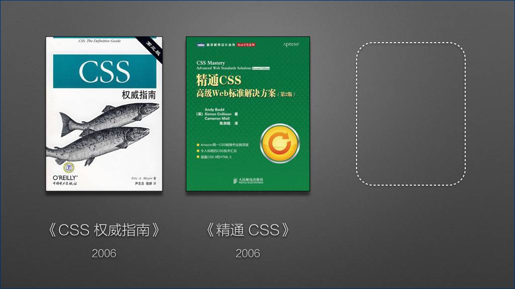
如果你的书架只能放得下三本 CSS 书,我会推荐哪三本呢?
[](https://docs.gechiui.com/gc-content/uploads/sites/kancloud/2015-09-11_55f26a6640c5b.jpg)
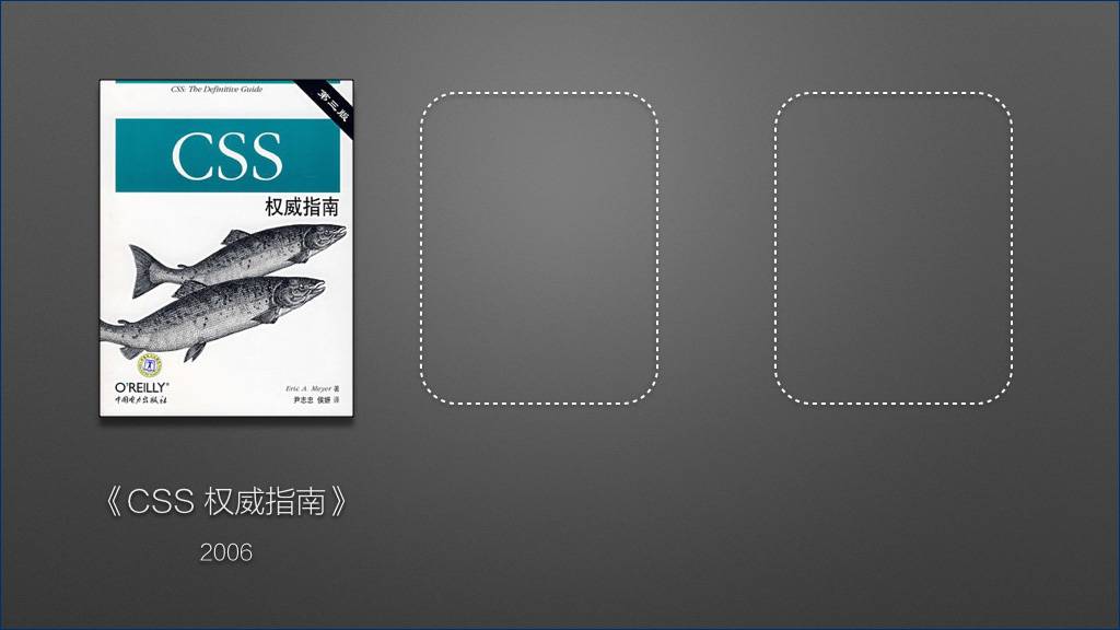
第一本,《CSS 权威指南》。
这是一本非常经典的 CSS 参考书,它的经典之处在于,它用普通人类可以理解的语言系统、全面地讲解了 CSS 规范。这本书会告诉你,CSS 是什么、CSS 有什么、CSS 可以做什么。
这本书的最新版本——第三版——的英文版出版于 2006 年。
[](https://docs.gechiui.com/gc-content/uploads/sites/kancloud/2015-09-11_55f26a68021f8.jpg)
第二本书,《精通 CSS》。这同样是一本非常经典的 CSS 图书,它侧重于实践,告诉你如何正确地使用 CSS。(封面图片采用了大家比较容易买到的中文版第二版。)
这本书的英文原版第一版出版于 2006 年。
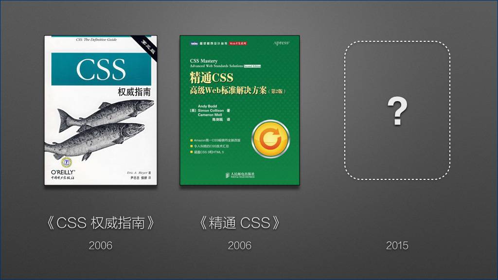
大家可能注意到了,这两本都出版于 2006 年。而今年已经是 2015 年了。
[](https://docs.gechiui.com/gc-content/uploads/sites/kancloud/2015-09-11_55f26a6941519.jpg)
近十年来,我一直在等待第三本重量级 CSS 图书的出现。
终于,它来了:
[](https://docs.gechiui.com/gc-content/uploads/sites/kancloud/2015-09-11_55f26a69c89b8.jpg)
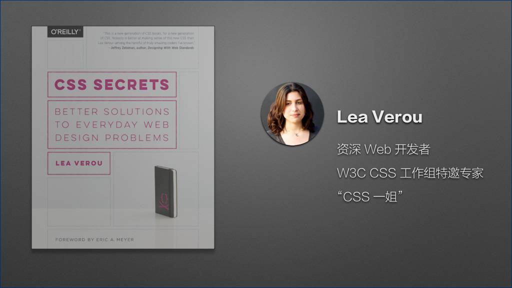
这本书叫《CSS Secrets》,6 月份刚刚出版。(这本书的中文名还没有正式确定,封面图片暂采用英文原版。)
我们先来看看它的作者:
[](https://docs.gechiui.com/gc-content/uploads/sites/kancloud/2015-09-11_55f26a6b4759d.jpg)
作者叫 Lea Verou,她是一位资深 Web 开发者,有着丰富的实践经验。更重要的是,她是 W3C CSS 工作组的特邀专家——CSS 工作组汇集了这个领域内的专家,他们是制定 CSS 规范、设计 CSS 这门语言的一群人——全球只有极少数顶尖的开发者才有机会获邀加入 CSS 工作组。
国内开发者亲切地称呼她为 “CSS 一姐”。
那这本书到底好在哪里呢?
[](https://docs.gechiui.com/gc-content/uploads/sites/kancloud/2015-09-11_55f26a6bb969e.jpg)
(此处略去两百字)
[](https://docs.gechiui.com/gc-content/uploads/sites/kancloud/2015-09-11_55f26a6c76750.jpg)
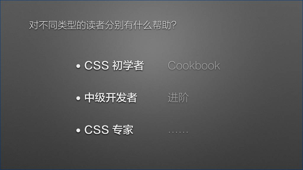
对 CSS 初学者来说,我强烈建议先去读前面两本书,因为读这本书还是需要有一定的基础的。如果实在等不及,可以把它当作 cookbook 来解决你迫在眉睫的问题。
对于中级的 CSS 开发者来说,这本书可以发挥最大的功效——它可以帮助你进阶。相信很多开发者在学习 CSS 到了一定阶段的时候,感觉自己好像什么都会了,但遇到复杂问题时往往又感觉捉襟见肘、力不从心。这就是遇到瓶颈了。如何突破瓶颈、进入下一个阶段?要做的无非是两件事——实践和思考。书并不能代替你思考,但一本好书可以向你示范,什么样的思考方式是正确的。
如果你已经是一位 CSS 专家了,已经有些飘飘然了,那这本书可以告诉你和这个星球上最顶尖的 CSS 专家的差距在哪里,从而帮助你找到人生下一阶段的目标和动力。
说了这么多,大家心里可能会想:你吹得挺玄乎,能不能举个书里面的例子来看一看?
[](https://docs.gechiui.com/gc-content/uploads/sites/kancloud/2015-09-11_55f26a6e099c6.jpg)
好,我们来看个例子。
在这里我要强调一下,因为时间关系,我在这里引用的只是一个非常浅显的案例。书中的绝大多数案例都要比它复杂。
这个例子是这样的:
[](https://docs.gechiui.com/gc-content/uploads/sites/kancloud/2015-09-11_55f26a6f04b41.jpg)
对于边框我们都非常熟悉了。边框是我们美化网页、增强样式最常用的手段之一。
[](https://docs.gechiui.com/gc-content/uploads/sites/kancloud/2015-09-11_55f26a6fa1981.png)
有些时候,我们的需求是给一个容器加上多重边框:
[](https://docs.gechiui.com/gc-content/uploads/sites/kancloud/2015-09-11_55f26a700070f.png)
对于这个需求,我们最容易想到的就是给它再加一层标签:
[](https://docs.gechiui.com/gc-content/uploads/sites/kancloud/2015-09-11_55f26a707d258.png)
不过有些时候,我们可能无法修改结构,或者修改结构的成本很高,此时就需要我们在纯 CSS 层面解决这个问题。
说到边框,首先我们可能会联想到 `outline` 属性。
[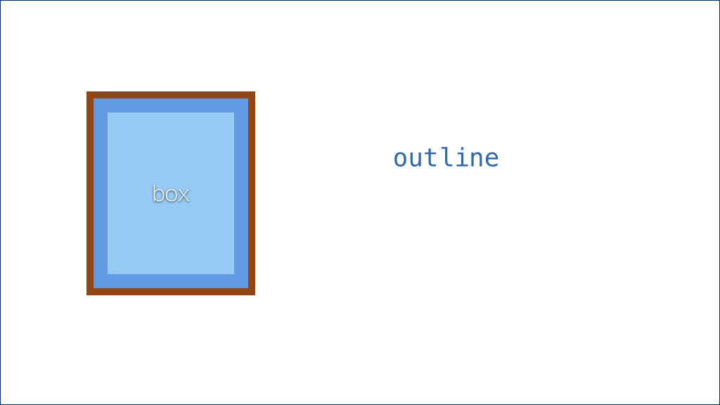](https://docs.gechiui.com/gc-content/uploads/sites/kancloud/2015-09-11_55f26a71c61a7.png)
我们暂且把 `outline` 称作 “描边”。描边属性跟边框有很多相似之处,但由于早期的 IE 并不支持,了解它的人可能没有那么多。描边是绘制在边框的外圈的,因此,通过 `outline` 属性我们就可以很容易地实现双层边框了。
描边有一个好处在于,它跟边框类似,可以设置各种线型,比如虚线:
[](https://docs.gechiui.com/gc-content/uploads/sites/kancloud/2015-09-11_55f26a733fa71.png)
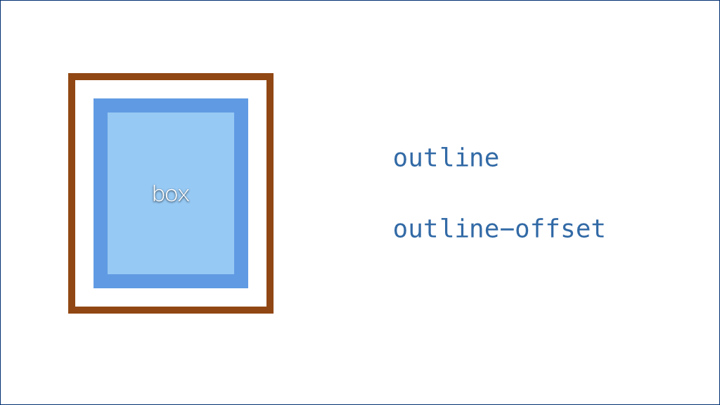
而且更好玩的是,还有一个 `outline-offset` 属性,可以控制描边的偏移量。
[](https://docs.gechiui.com/gc-content/uploads/sites/kancloud/2015-09-11_55f26a74b75d9.png)
我们可以把这层描边扩展出去:
[](https://docs.gechiui.com/gc-content/uploads/sites/kancloud/2015-09-11_55f26a7e720fc.png)
这个属性甚至还可以接受负值。如果是负值,描边会向内收缩,并叠加在边框之上:
[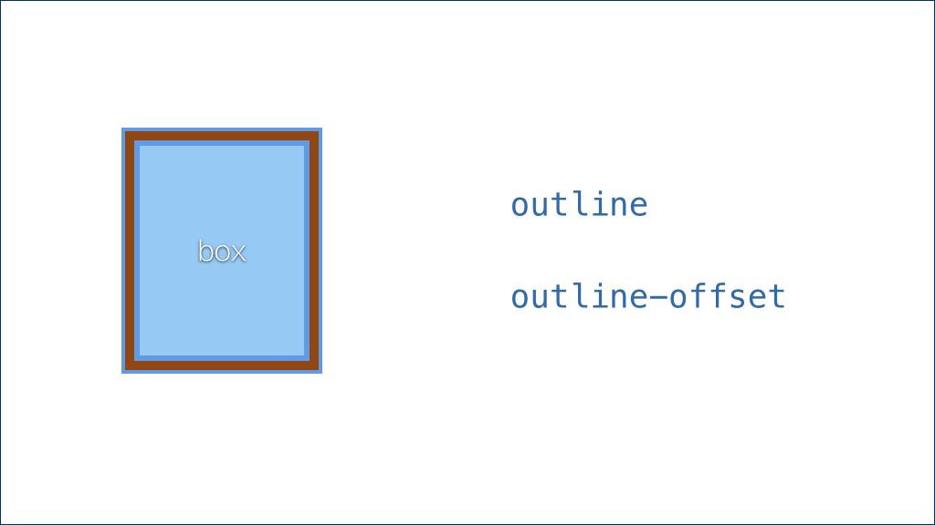](https://docs.gechiui.com/gc-content/uploads/sites/kancloud/2015-09-11_55f26a7fbb577.png)
利用这个特性可以玩出很多好玩的效果。
不过描边有一个缺陷——如果这个容器本身有圆角的话,描边并不能完全贴合圆角。目前所有浏览器的行为都是这样的:
[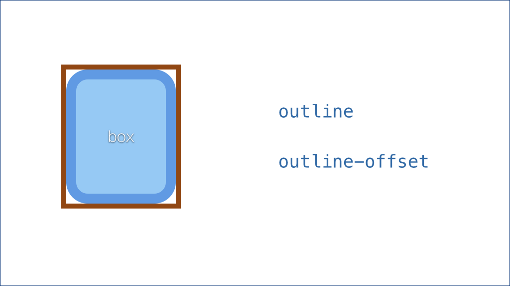](https://docs.gechiui.com/gc-content/uploads/sites/kancloud/2015-09-11_55f26a82931ac.png)
所以,如果你需要圆角,就要另寻它法了。
于是接下来,我们又想到了投影这个属性。
[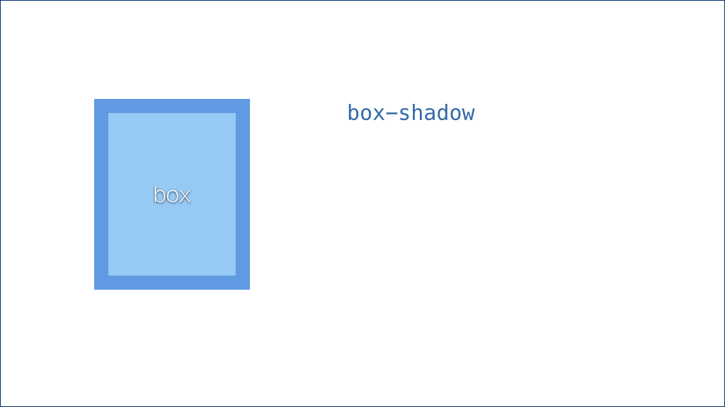](https://docs.gechiui.com/gc-content/uploads/sites/kancloud/2015-09-11_55f26a840744f.png)
相信大家都用过投影,它可以让我们的网站更具立体感和层次感。
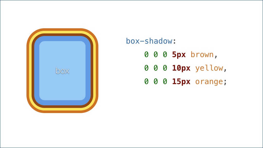
我们通常是这样设置投影的:
[](https://docs.gechiui.com/gc-content/uploads/sites/kancloud/2015-09-11_55f26a930cbaa.png)
前面三个长度值,再加一个颜色值。
前两个长度值分别表示投影在水平和垂直方向上的偏移量,第三个长度值表示投影的模糊半径(也就是模糊的程度);颜色值就是投影的颜色。
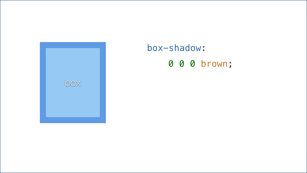
如果我们把前三个值都设为零,实际上是没有任何效果的。因为如果投影即不偏移也不模糊,刚好会被这个元素自己严严实实地遮住。
很多人可能不知道的是,投影还可以有第四个长度值。这个值表示投影向外扩张的程度:
[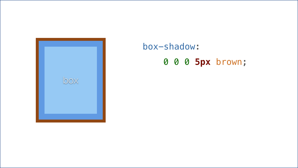](https://docs.gechiui.com/gc-content/uploads/sites/kancloud/2015-09-11_55f26a93650f9.png)
这样,投影就会从元素的底下露出一圈了。
关于投影,另外一个不是每个人都知道的特性是,投影属性其实可以接受一个列表,我们可以一次赋予它多层投影,像这样:
[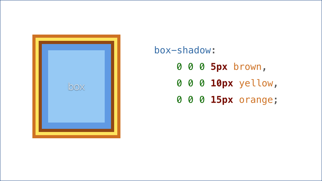](https://docs.gechiui.com/gc-content/uploads/sites/kancloud/2015-09-11_55f26a93d368c.png)
这样我们就得到了超过两层的 “边框” 效果了。
投影的另外一个好处是,它的扩张效果是根据元素自己的形状来的。如果元素是矩形,它扩张开来就是一个更大的矩形;如果元素有圆角,它也会扩张出圆角。
[](https://docs.gechiui.com/gc-content/uploads/sites/kancloud/2015-09-11_55f26a9431759.png)
所以对于圆角的场景,它也不在话下。
[](https://docs.gechiui.com/gc-content/uploads/sites/kancloud/2015-09-11_55f26a9990f75.png)
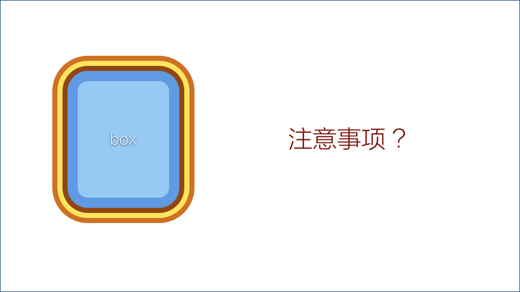
这两种方法还有什么需要注意的地方?这本书也很贴心地注明了。
由于描边和投影都是不影响布局的,所以如果这个元素和其它元素的相对位置关系很重要,就需要我们以外边距等方式来为这些多出来的 “边框” 腾出位置,以防被其它元素盖住。
因此,从这个意义上来说,使用内嵌投影似乎是更好的选择。因为内嵌投影让投影出现在元素内部,我们可以用内边距在元素的内部消化掉这些额外 “边框” 所需要的空间,处理起来更容易一些。
[](https://docs.gechiui.com/gc-content/uploads/sites/kancloud/2015-09-11_55f26a9a0f888.jpg)
好的,这个例子就讲完了。
(掌声。)
讲到这里,我看到有些同学一脸意犹未尽的表情,你们的心情可能是这样的:
[](https://docs.gechiui.com/gc-content/uploads/sites/kancloud/2015-09-11_55f26a9a81bc1.jpg)
OK,再来一个。
这个例子并不是书中直接提到的,而是我在读这本书的过程中,受它启发,再结合自己的实践所想到的,这里拿出来跟大家分享。
这个案例叫做:
[](https://docs.gechiui.com/gc-content/uploads/sites/kancloud/2015-09-11_55f26a9aeeb7a.jpg)
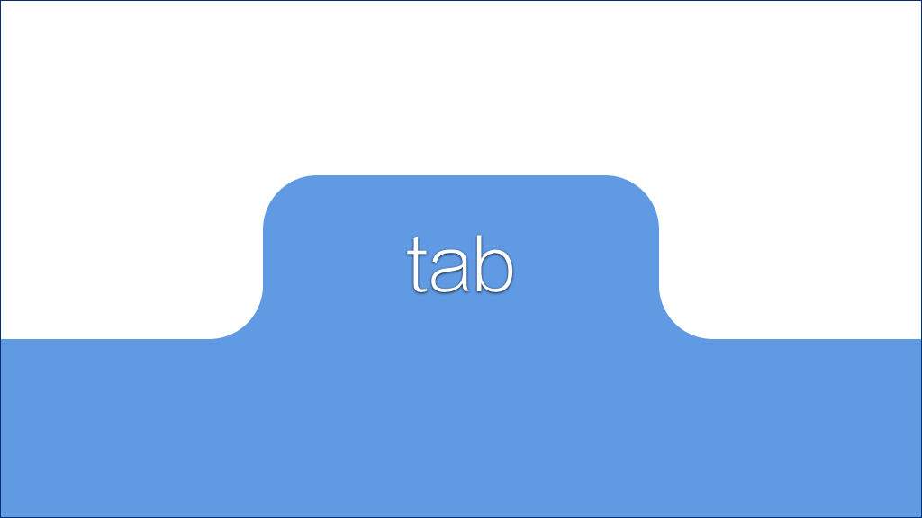
什么叫 “圆润的标签页” 呢?
标签页我们都很熟悉了,它是一种常用的 UI 元素。
[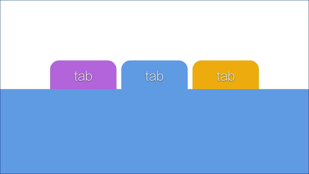](https://docs.gechiui.com/gc-content/uploads/sites/kancloud/2015-09-11_55f26a9b8c758.png)
我们把它拉近来看一看:
[](https://docs.gechiui.com/gc-content/uploads/sites/kancloud/2015-09-11_55f26a9bd5311.png)
这个标签还是比较美观的,我们用圆角让它看起来很接近真实的标签造型。不过我们也注意到,它底部的两个直角看起来似乎有点生硬。
所以设计师原本期望的效果可能是这样的:
[](https://docs.gechiui.com/gc-content/uploads/sites/kancloud/2015-09-11_55f26a9c34891.png)
这样就自然多了。但这看起来似乎很难实现啊!
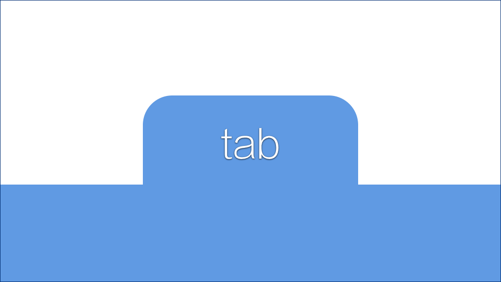
我们的难点主要在这里:
[](https://docs.gechiui.com/gc-content/uploads/sites/kancloud/2015-09-11_55f26aa7dee93.png)
这个特殊的形状如何实现?
我们把它放大来看一下:
[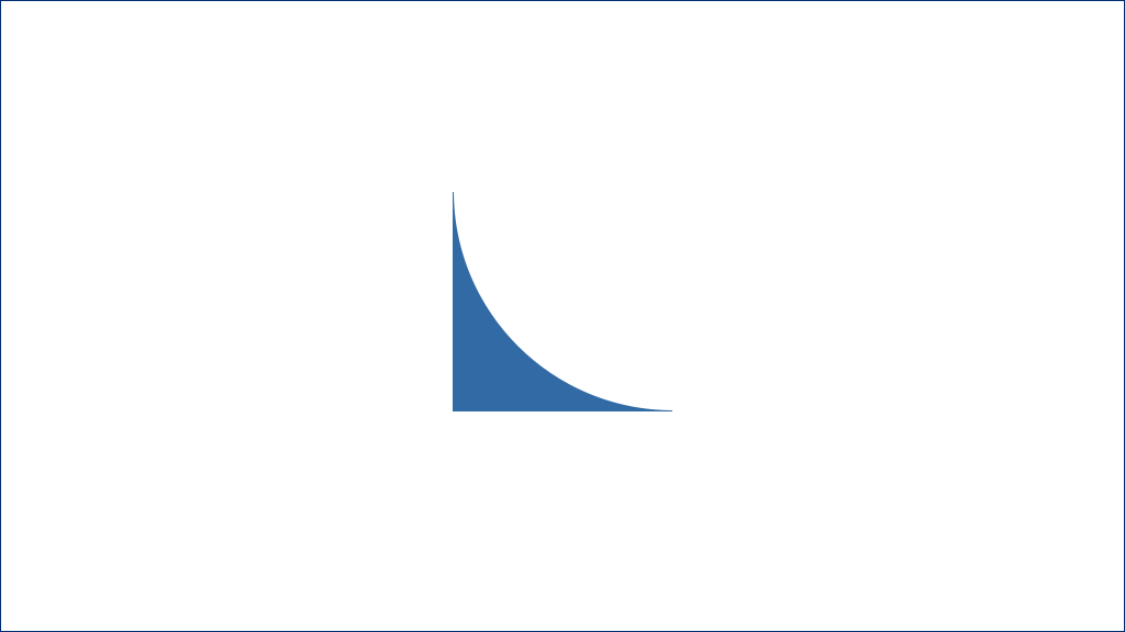](https://docs.gechiui.com/gc-content/uploads/sites/kancloud/2015-09-11_55f26ab1df64b.png)
首先我们可能会想到用图片。这当然是可行的,但图片有种种局限,我们最好还是完全用 CSS 来实现它。
好,接下来我们来分析一下它的形状。它其实就是一个方形,再挖掉一个 90° 的扇形。于是我们试着创建一个方形,再用背景色做出一个扇形叠加上去:
[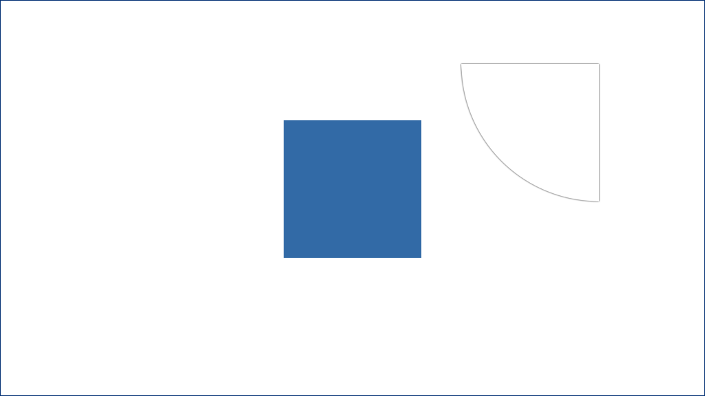](https://docs.gechiui.com/gc-content/uploads/sites/kancloud/2015-09-11_55f26ab364964.png)
看起来好像可以了。但这是骗人的啊!
把它放在复杂背景下,立马就露馅了——扇形部分不是透明的:
[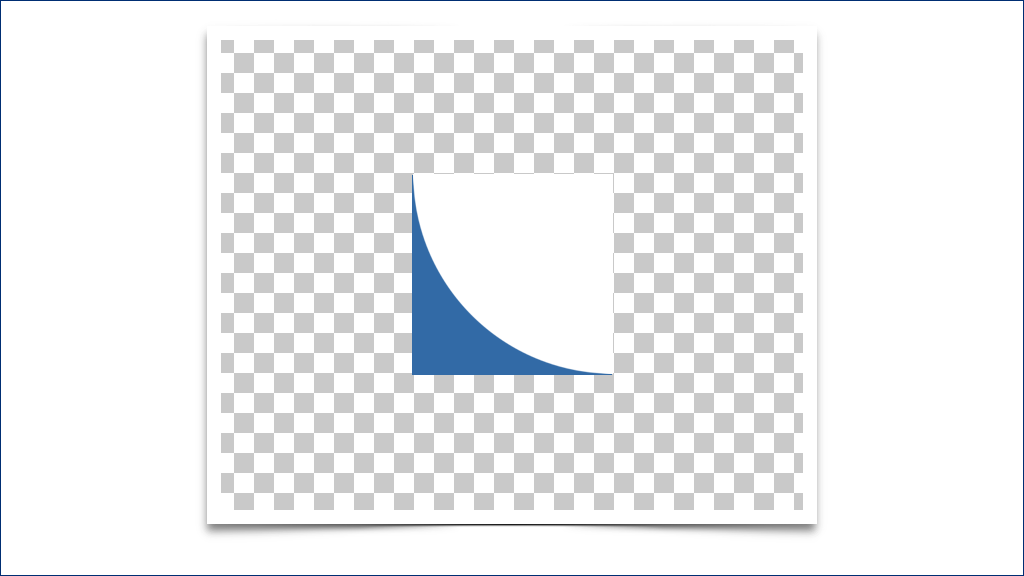](https://docs.gechiui.com/gc-content/uploads/sites/kancloud/2015-09-11_55f26ab3d4b58.png)
所以,我们的问题就变成了:
[](https://docs.gechiui.com/gc-content/uploads/sites/kancloud/2015-09-11_55f26ab93043b.jpg)
对于普通外凸的圆角,我们都已经非常熟悉了:
[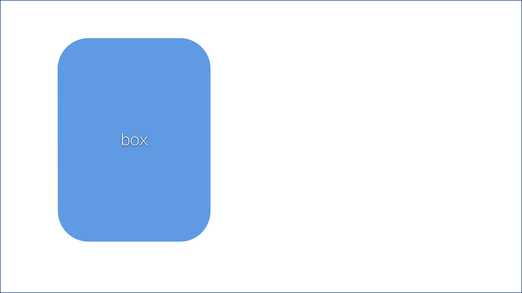](https://docs.gechiui.com/gc-content/uploads/sites/kancloud/2015-09-11_55f26aba305a1.png)
我们用圆角属性就可以得到:
[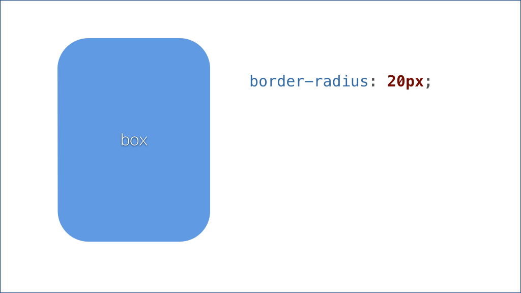](https://docs.gechiui.com/gc-content/uploads/sites/kancloud/2015-09-11_55f26abaa3a37.png)
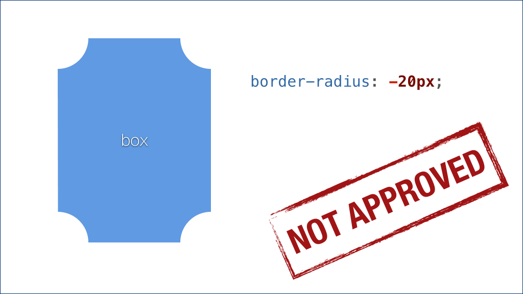
但我们需要的是一个内凹的圆角形状。
这是一个实实在在的需求,于是有开发者曾经提议,扩展圆角属性,让它支持负值。如果是负值,圆角就不再是外凸的,而是内凹的。这个提议听起来似乎很有道理,语法设计也很紧凑。
[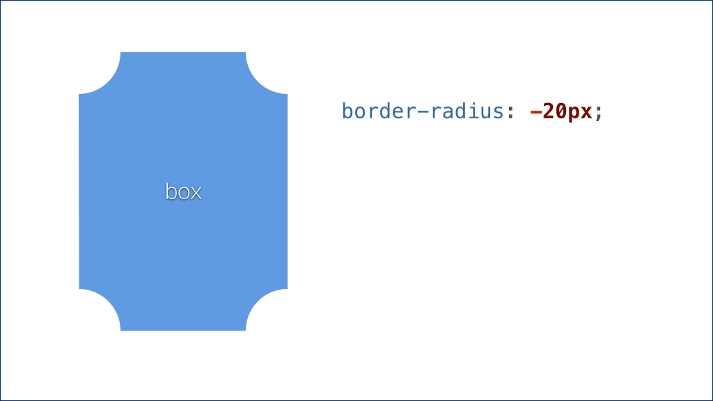](https://docs.gechiui.com/gc-content/uploads/sites/kancloud/2015-09-11_55f26abaf0dc4.png)
但实际上它的语义不够准确。因此 CSS 工作组并没有接受这个提议,并未将它纳入标准。
[](https://docs.gechiui.com/gc-content/uploads/sites/kancloud/2015-09-11_55f26abb46c8c.png)
这条路走不通,我们还需要继续探索。
我们顺着这个方向,头脑中很自然地会迸出这个疑问:
[](https://docs.gechiui.com/gc-content/uploads/sites/kancloud/2015-09-11_55f26abbc7a15.jpg)
答案当然是有的:
[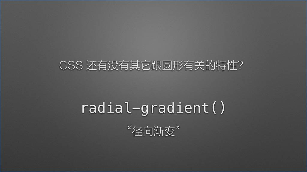](https://docs.gechiui.com/gc-content/uploads/sites/kancloud/2015-09-11_55f26abc79fd8.jpg)
“径向渐变” 特性就是跟圆形有关的。
不过它稍稍有些复杂。在讲解径向渐变之前,我们先来看一看比较简单的 “线性渐变”。
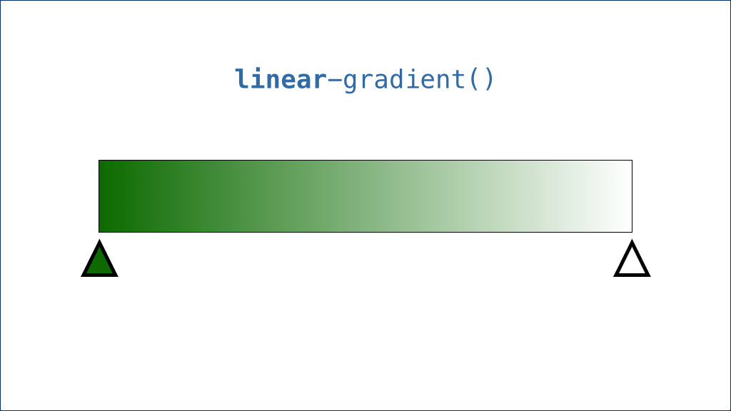
[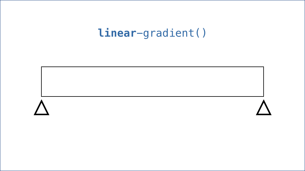](https://docs.gechiui.com/gc-content/uploads/sites/kancloud/2015-09-11_55f26abdb6387.png)
说到渐变,那自然需要有一个容器。然后,还需要有两种颜色。渐变的颜色设置我们称之为 “色标”——每个色标不仅有颜色信息,还有位置信息。
我们给起点和终点的色标分别设置颜色,就可以得到一条渐变图案:
[](https://docs.gechiui.com/gc-content/uploads/sites/kancloud/2015-09-11_55f26abe3743f.png)
我在这里使用了绿色来展示这个渐变,大家可能会觉得绿色很难看。实际上这是有意安排的——由于人眼对绿色的亮度变化是最为敏感的,这里使用绿色是为了让大家看得更清楚,而不是我的审美出了问题。(笑声。)
接下来,关于渐变,我们其实可以设置不止两个色标。比如我们可以在中央再增加一个色标。请注意我们特意选择了跟起点色标一样的颜色。我们得到的效果如下:
[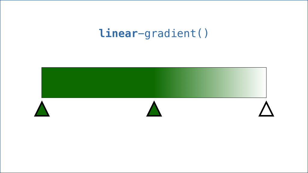](https://docs.gechiui.com/gc-content/uploads/sites/kancloud/2015-09-11_55f26abe854c0.png)
我们发现,渐变只发生在颜色不同的色标之间。如果两个色标的颜色相同,则它们之间会显示为一块实色。
好的,我们继续增加色标。这次我们在渐变地带的中央增加一个色标,且让它的颜色和终点色标相同:
[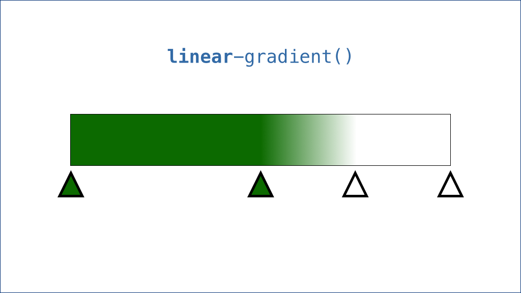](https://docs.gechiui.com/gc-content/uploads/sites/kancloud/2015-09-11_55f26abed8274.png)
根据上面的经验,这个结果正是我们所预料的——渐变只发生在颜色不同的色标之间。
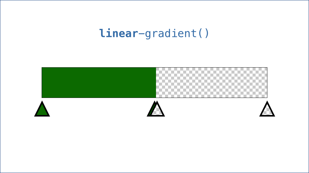
接下来,我们玩点更特别的,我们把中间的两个色标相互靠近直至重合,会发生什么?
[](https://docs.gechiui.com/gc-content/uploads/sites/kancloud/2015-09-11_55f26abf51dcf.png)
实际上这个渐变也会趋向于零。也就是说,虽然这本质上仍然是一个 “渐变” 图案,但经过我们的精心设计之后,我们最终得到了两个纯色的色块条纹。
如果我们把终点颜色换为透明色……
[](https://docs.gechiui.com/gc-content/uploads/sites/kancloud/2015-09-11_55f26ac4d5636.png)
我们甚至还会得到实色和透明色间隔的条纹。
好的,接下来我们来看径向渐变。它稍稍有些复杂,但原理是一样的。
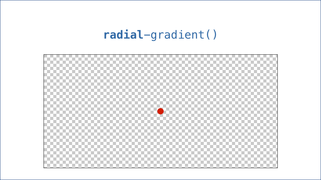
同样,我们需要有一个容器。但对径向渐变来说,顾名思议,所有色标是排布在一条半径上的。也就是说,我们还需要有一个圆心。默认情况下,圆心就是这个容器的正中心:
[](https://docs.gechiui.com/gc-content/uploads/sites/kancloud/2015-09-11_55f26ac54f137.png)
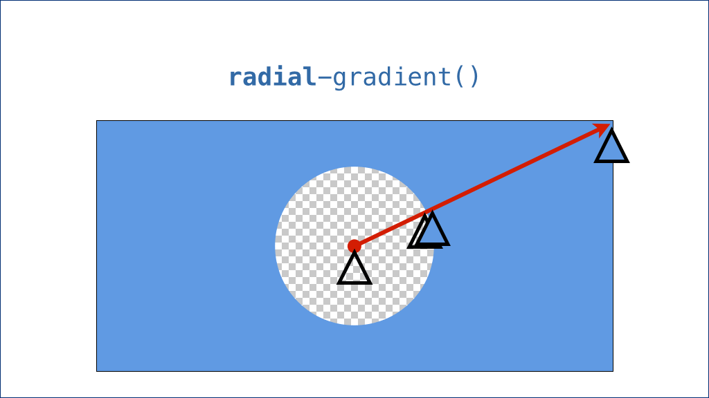
而这条半径就是圆心指向容器最远端的一条假想的线:
[](https://docs.gechiui.com/gc-content/uploads/sites/kancloud/2015-09-11_55f26ac5979ad.png)
接下来,我们要设置一些色标:
[](https://docs.gechiui.com/gc-content/uploads/sites/kancloud/2015-09-11_55f26ac6202ff.png)
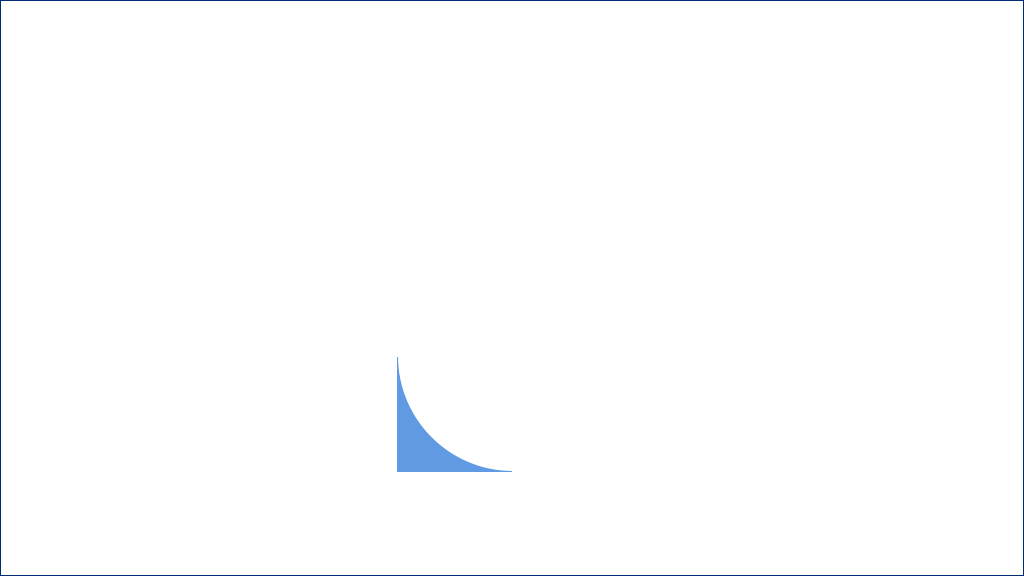
说到这里,就要讲解一下径向渐变的特别之处。所有色标的颜色变化推进不是像线性渐变那样平行推进的,而是以同心圆的方式向外扩散的——就像水池里被石子激起的涟漪那样。
看到这个色标的分布,我们应该可以想像出线性渐变的结果是什么;但这里我们把它按照径向渐变的特征来推演一下,实际上最终的效果是这样的:
[](https://docs.gechiui.com/gc-content/uploads/sites/kancloud/2015-09-11_55f26ac66e3c7.png)
我们把所有辅助性的标记都去掉,只留下渐变图案:
[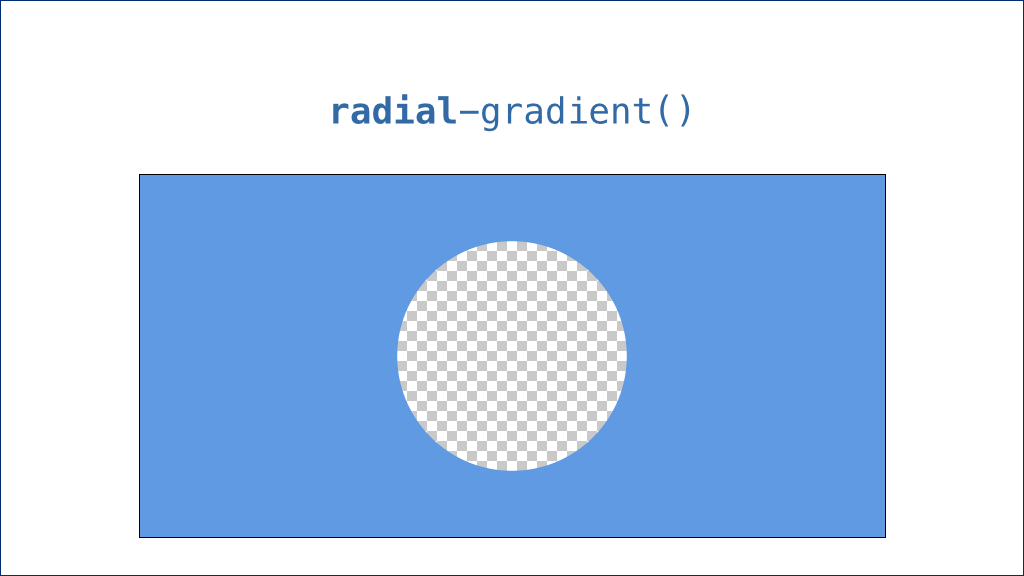](https://docs.gechiui.com/gc-content/uploads/sites/kancloud/2015-09-11_55f26ac6db5b0.png)
这是一个穿了个窟窿的实色背景。很好玩是吧?不过不要忘了我们是为什么来到这儿的——我们是为了得到一个内凹圆角的形状。
细心的朋友可能已经发现了,我们需要的东西已经出现了:
[](https://docs.gechiui.com/gc-content/uploads/sites/kancloud/2015-09-11_55f26ac754af2.png)
接下来,我们调整一下圆心的位置和容器的尺寸,就可以得到这个内凹圆角的造型了。
[](https://docs.gechiui.com/gc-content/uploads/sites/kancloud/2015-09-11_55f26ac7a2b3c.png)
利用这个技巧,我们用纯 CSS 最终实现了这个看似不可能的 “圆润的标签页” 效果!
[](https://docs.gechiui.com/gc-content/uploads/sites/kancloud/2015-09-11_55f26a9c34891.png)
(掌声。)
[](https://docs.gechiui.com/gc-content/uploads/sites/kancloud/2015-09-11_55f26ac89da0e.jpg)
好的,我们来回顾一下今天分享的主要内容:
[](https://docs.gechiui.com/gc-content/uploads/sites/kancloud/2015-09-11_55f26ac9560eb.jpg)
(现场的分享到这里就结束了。以下是因为时间关系被剪掉的片断。)
[](https://docs.gechiui.com/gc-content/uploads/sites/kancloud/2015-09-11_55f26acb8f5e1.jpg)
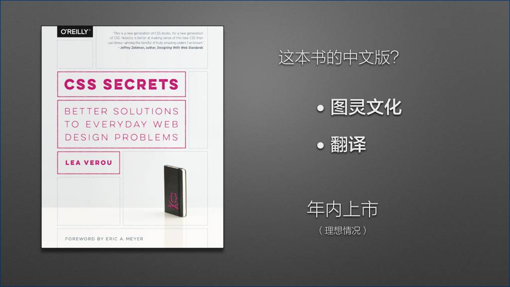
关于《CSS Secrets》这本书,大家可能会有一个问题:
这本书有中文版吗?
[](https://docs.gechiui.com/gc-content/uploads/sites/kancloud/2015-09-11_55f26ad8a1552.jpg)
这本书已经由国内顶尖的计算机图书公司 “图灵文化” 引进;同时,我本人也很荣幸争取到了这本书的中文版翻译权。
[](https://docs.gechiui.com/gc-content/uploads/sites/kancloud/2015-09-11_55f26ad9316aa.jpg)
在最理想的情况下,这本书的中文版在年内就可以在各大书店上架。当然,电子版会更快,图灵官网最快本月内就会发布免费试读章节。
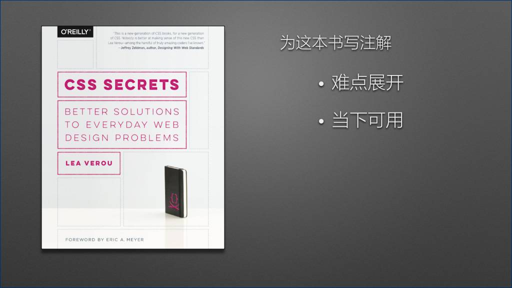
在翻译这本书的过程中,我有很多想要补充的内容,但限于篇幅,不可能在原书中插入过多的译注。因此,我萌生了一个想法——为这本书写注解。
[](https://docs.gechiui.com/gc-content/uploads/sites/kancloud/2015-09-11_55f26adf096fe.jpg)
萌生这个想法有两个原因:
一方面,这本书不适合初学者阅读,书中的很多难点都一笔带过了,而这些难点往往是值得展开讨论的。
另一方面,书中提供的解决方案以标准为导向,极少涉及浏览器的私有属性。部分解决方案所采用的 CSS 特性太新,以致于在眼下还没有浏览器很好地实现。而实际上有些非标准的解决方案已经比较成熟了,在特定场景下往往会发挥更好的作用。我认为有必要提供这些知识,以供国内的开发者们参考。
[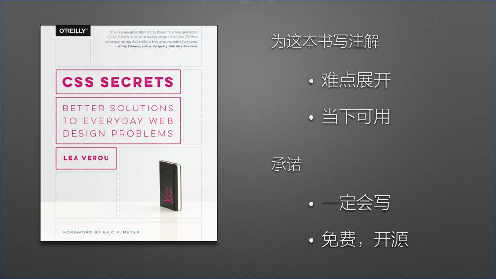](https://docs.gechiui.com/gc-content/uploads/sites/kancloud/2015-09-11_55f26adf86fcf.jpg)
在翻译完这本书之后,我一定会写。写多少字、什么时候写完,现在还不确定,但我在这里可以承诺的是,我一定会写。
而且,我会以免费、开源的方式来完成这个计划。原书是需要大家自己购买的,但我写的这份注解一定会在 GitHub 上免费发布!
(此处可能有掌声。)
[](https://docs.gechiui.com/gc-content/uploads/sites/kancloud/2015-09-11_55f26ae04332f.jpg)
我今天的分享到这里就结束了,大家有问题吗?